A good logo can do a lot for brand recognition. When it comes to shoes, iconic logos like the Nike swoosh or adidas stripes are instantly recognizable, and more than a few shoes are sold simply because of the cool-factor associated with their presence.
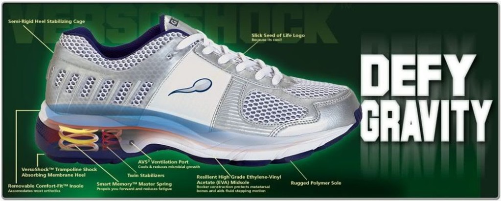
On the other hand, a bad logo can leave a brand open to ridicule, and in some cases can even lead to stores refusing to carry their shoes. Such was the case with the brand Gravity Defyer. A few years ago I would often see web ads for Gravity Defyer shoes, and had to chuckle at the fact that they had what appeared to be a sperm logo on the sides:
I suspect that wearing a shoe with a sperm on the side is an effective form of contraception.
The shoes feature springs in the heel, as well as trampolines and stabilizers, and were often featured in the Skymall Catalogue (Skymall was a retailer whose catalogue was found in seat pockets of airplanes in the US – they are now out of business). You might think that the logo was intended to represent something else (maybe a tadpole?), but according to this article on Business Insider, the choice of a sperm logo was indeed intentional:
"Our logo is deliberate. Our customers feel like they are getting the beginning of a new life when they try our shoes," said Alexander Elnekaveh, CEO of Gravity Defyer. "We are not embarrassed by it."
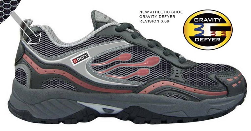
Well, apparently times have changed, and not even the addition of multiple sperm was enough to prevent an inevitable logo change:
Nothing inspires speed like a race to conceive new life! And I wonder if there is any relation between the 3-sperm logo and the fact that this was “Revision 3.69”?
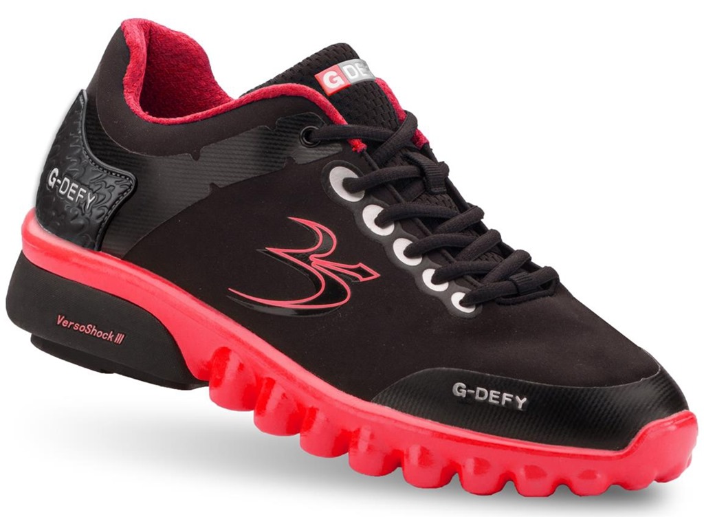
I’m not sure exactly when it happened, but Gravity Defyer now has a new logo, and sperm are no longer splashed on the sides of their shoes:
My initial reaction is that the logo looks a bit like the Om symbol – maybe they’re going after the yoga crowd?:
It’s definitely an improvement, though the bar was set pretty low by whoever decided to put reproductive cells on the earlier shoes.
Let this be a lesson to all marketers and shoe designers – though a great shoe may make you feel newly alive, celebrating that feeling with sperm is never a good idea.






Still laughing at, “…sperm are no longer splashed on the sides of their shoes”!
Ha! I remember that stupid shoe from airplane flights. It’s not just the logo that should be done away with. I don’t know if I’ve ever actually seen someone wearing that particular model, but I always shake my head when I see older people hobbling around in big clunky shoes like these. They’re marketed to people who could probably stand to build strength in their feet, but never will in these things.
Oh man, I didn’t know those existed, thanks for the enlightenment. Unfortunately the om symbol was not the first thing I thought of when I saw the new logo, and I’m a yogi. It kinda looks like something worse than sperm.
Wow I didn´t know they even existed! I wonder what I would´ve said to friends when showing them my new sperm logo shoes!
I did not know that there was this brand of shoes, the fact of wanting to represent a new life with a sperm is not bad, but if it is by the support that contains it, in this case a sneaker. The new logo isn’t good either.
Perhaps, like you, the designer of the multiple sperm iteration of the logo was a father of three …
I worked as a nurse 12 hour shifts on OB unit. I loved these shoes! They were great for 12 hour shifts, I never had sore back or legs. We always had something to talk about, and I’m a woman.
Had a friend who worked in a retail store for these guys in OC.
She was awesome, but the whole speed thing was a bit much.
I stil remember her excitement over getting the job – combined with a total embarrassment over the logo. Lol
The new logo looks like something that produces the old logo. Neither are great moves. And neither look like they were made by a designer who cares. Looks like someone slapped two Nike “swooshes” and mashed them together.