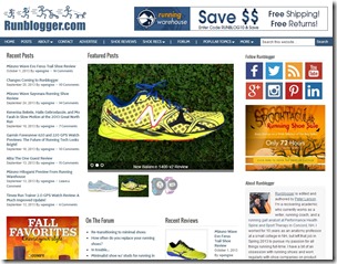
 Four and a half years ago I started Runblogger on Google’s Blogger platform. Blogger is a great service, and I learned a lot about web design by using it (you need to know a bit of HTML and CSS to modify Blogger templates). However, over the past few months I’d come to realize that there were some limitations to using the platform that could be overcome by moving to a self-hosted WordPress site. I decided to make the switch back in September, and as you can see the move is now complete (mostly…more on that below).
I have a bunch of reasons for leaving Blogger for WordPress, and these included:
1. I wanted to have full ownership of my site. Google has stopped development of or eliminated a lot of services that I have used in the past (e.g., Feedburner, Google Reader), and though I don’t think Blogger will go away, self-hosting my site would prevent this from becoming an issue should it happen someday. I now own the domain and pay for premium hosting at WPEngine via Folivision (I decided to opt for premium hosting for security and site speed reasons).
2. Greater design customization flexibility. WordPress allows much more flexibility in designing custom templates for pages, basic design is easier, and it has loads of plugins that offer lots of functionality. The new site was built on WordPress using the Genesis framework and the Dynamik Website Builder (I’ve done most of the design work myself). I have found this combo to be very easy to use and it allows for a great deal of customization of the design without having to dig too much into html or CSS (though I’ve come to enjoy doing). I’ve actually now used the combo of Genesis and Dynamik on a few sites and I highly recommend it.
3. I wanted to move the Runblogger forum under the same domain as the blog. I couldn’t do this if I stayed on Blogger. The Forum was moved from its own domain to it’s new location at www.runblogger.com/forum.
4. I wanted a friendlier mobile design (have received numerous requests for this in the past). This is still a bit of a work in progress, but if you access Runblogger from a smartphone now it should be much easier to navigate and read than the old site. You can get a sense of what the responsive design of the new site is like by playing with the size of your browser window – you’ll see sidebars disappear and things move around to accommodate the changing screen size. Pretty cool!
5. I wanted to change my comment system away from Disqus since I felt like it slowed my page loads and I often received complaints about comments getting eaten when trying to post. For a new commenting system I chose FV Thoughtful Comments and I’m liking its simplicity quite a bit compared to Disqus.
Migrating a site like this one is not without challenges. I had over 950 posts and 14,000 comments to move, and I wanted to do so without losing anything. In particular, I’ve built up a lot of links over the years and wanted to avoid any chance that moving the site would hurt my Google rankings. Given that this site is my main source of income now, I decided to hire a company called Foliovision to handle the move (mainly so I wouldn’t screw anything up!). The folks at Foliovision are very skilled at doing this kind of thing, and so far it looks like everything transferred over without a hiccup, and all looks good with Google. Foliovision also handled moving my forum for me, and short of a few issues with logins that went smoothly as well (login issue should be fixed now thanks to Ivana at Foliovision, if you are having trouble let me know). I’m very happy with the work they have done.
My goal with the new site design was to make it cleaner, with a wider reading pane, yet maintain the advertising that I rely on for my income. I’m still playing with the right mix, but I’m pretty happy with the way things look so far.
I still have some things to work on to get the new site set (like the fact that WordPress stripped out all of my YouTube video embeds…), and if you notice anything that is a problem or have any suggestions, please let me know!








New site looks fantastic, Pete! Great job :)
Thanks James!
Bravo, sir!
Thanks Bryan!
Congratulations Pete! I’m sure you’ll love WordPress. I’ve got three WordPress sites, though only one of them is responsive (resonancemastering.com). That’s next on my list!
The site looks great with a wide browser window, but gets pretty busy as things narrow down, even on an iPad.
A few suggestions:
I’d dump the Pinterest, Reddit, and StumbleUpon buttons because nobody uses them. I’d also dump one set of “Follow Runblogger” icons (the second one, after the popular posts widget).
If you don’t want to clear away any of the other page content, you could at least consolidate the main navigation. You don’t need a home link, because people should know to click the header graphic. Surely contact and advertising information would be perfect for the about page, which would mean two less options. Similarly, shoe recommendations could easily be at the top of the shoe reviews page.
I find the use of the “|” divider in the top navigation bar unnecessary and visually inconsistent. A little more space between fewer options would do the job without overwhelming.
Popular topics could go in the left sidebar above the shoe reviews by brand, and if the stuff under “more” is really necessary (I don’t think it is), it could go there too.
Alright, I’m getting carried away! Bottom line, I think reducing the visual clutter and minimizing options will make for a more pleasant experience for your readers.
Brian,
Thanks for the feedback. I agree on Reddit and Stumbleupon, rarely get shares but when I do they send a bunch of traffic. But those motivated to do so can find other ways.
As for the other stuff, there are reasons why most of that is there. I have click tracking on most of the items you mention in the navbar and they are things that need to be there – they all carried over based on a long history of use on my blogger site.
I’ve always struggled with reducing clutter and keeping things that have worked well for a long time, and I tend to lean toward the latter :)
Pete
Maybe I’m nobody, but I use Pinterest buttons all the time and really appreciate blogs that have them.
You’re right – there are quite a few sites that owe a big chunk of traffic to Pinterest. Not as much in the footwear niche, but I use it a bit.
Sorry Sarah! I could have worded that more gracefully. What I mean to say is, this isn’t the type of blog that is likely to see many pins. I haven’t done an exhaustive search, but I don’t see any at all on recent posts. My experiments on my own sites yielded zero engagement. Then again, if I had one regular reader that used it consistently, I’d consider the button worthwhile!
does need a bit of a tidy up but its a step in the right direction
Thanks Peter, great to be here ;)
Though not a restless person myself, I do like changes (“it’s the only evidence of life”), and thus welcome the new design! A bit overwhelming at first, but we will all get used to it.
Keep them shoe reviews coming, there are so many models out there to try!
Thanks Christian! It was a change born of necessity, I had pushed Blogger to its limits and there were just some things it would not be able to do.
Just found your site. Some really interesting stuff especially the gait analysis videos.
Thanks for stopping by!
Looks terrific, Pete. It’s wonderful to see your site growing and changing – your hard work is paying off!
Thanks Lynn!
When I started blogging I stuck w/ blogger b/c I knew u used it. I am now making some money from Adsense and don’t want to move even though it looks like WordPress is the way to go. Do u think it would be difficult to integrate Adsense into WordPress? Also, I think the new google+ commenting system on blogger is pretty amazing and helps increase visibility of my site, so I wonder if WordPress has a google + comment pluggin yet?
Not sure about the Google+ comment system, but Adsense integrates with WordPress without issue. There’s nothing inherehtly wrong with Blogger, just depends on your long term plans for your site. WordPress offer more flexibility.
Pete, I found your site a while back when I was trying to unravel the hype surrounding the minimalism craze. I appreciated your informed posts on the subject. The new site looks great–I’m hoping it continues to expand!
Thanks Jeremy!
Thanks Jeremey!