Sometimes a few simple pictures and videos can speak volumes. As part of my final set of lectures in my exercise physiology class this semester, I discussed the current state of affairs in the United States regarding physical activity, obesity, and the relationship of each of these to disease trends (I focused primarily on heart disease). The picture that I painted for my students was not pretty – take a look at the information below, and I think you’ll agree.
First, here are a series of maps showing obesity rates (BMI >30) by state from the years 1985-2008. This is not an encouraging trend (light blue = good, red = bad).
Obesity in the United States – CDC Maps from 1985-2008 from Runblogger on Vimeo.
CDC Maps Showing Obesity Trends in the United States from 1985-2008. For these maps, obesity was defined as a BMI of greater than or equal to 30. Maps are from http://www.cdc.gov/obesity/data/trends.html#State.
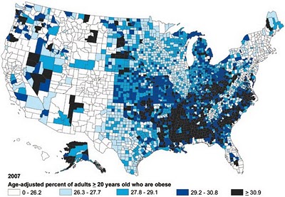
Next, here is a map showing CDC data on obesity rates in the United States by county in 2007 (click the image to view a larger version):
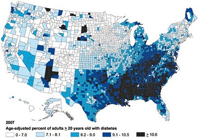
Next, here is a map showing CDC data on diabetes rates in the United States by county in 2007 – notice a trend here (click the image to view a larger version)?
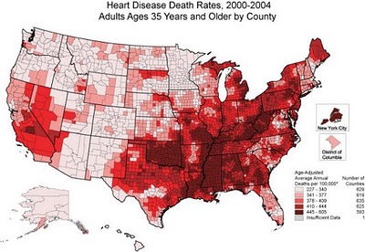
Now lets take a look a CDC data on heart disease death rates by US county from 2000-2004 (click the image to view a larger version):
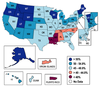
And we’ll finish up here with a CDC map showing the percentage of adults by state who meet minimum government recommendations for physical acitivity in the year 2007. These recommendations can be met by:
i. Participating in moderate-intensity activities for at least 30 minutes/day, at least 5 days/week.
-these activities include brisk walking, bicycling, vacuuming, gardening, or anything else that causes small increases in breathing or heart rate
ii. Participating in vigorous-intensity activities for at least 20 minutes/day, at least 3 days/week.
-these activities include running, aerobics, heavy yard work, or anything else that causes large increases in breathing or heart rate
Here’s the physical activity map (click the image to view a larger version):
As someone who teaches about the positive health benefits of exercise, but who also has seen firsthand these benefits to my own body, these maps concern me greatly. It seems pretty clear that the least physically active areas of the country are also the most obese, and most prone to diabetes and death from heart disease. There are certainly socioeconomic factors involved here that complicate things, but these data are still compelling. It is for this reason that I encourage anyone reading this to be an advocate for exercise. Set a positive example for your families, your neighbors, and your community by getting active – it will benefit you, and it will benefit them. Even if its as small a thing as lacing up a pair of shoes and heading out the door for a walk, all of us have the ability to be the positive examples that this country needs. Be that example.
To meet some people who have set amazing examples by getting active, check out this post: Losing Weight Through Exercise and a Healthier Lifestyle – Stories of Personal Transformation







Speak Your Mind